In the previous step of the designing process the volume limitations, placement, basic concept and idea have been set for the extension. We chose to hide it underground and bring only several vertical segments above ground in order to minimize the footprint on the square, enrich the space and also guide natural light to the interior.
The idea to turn the skylights into "statues" visible from the square, suggesting the extension underground was strongly inspired by artists involved in site-specific and process art.
Exploring this field of art further I became most interested in the artists' approach to light and perception of materials.
Most appealing pieces of art to me involved high level of contrast, very dramatic lighting and a concept of transparency.
In terms of working with the natural lighting and creating settings full of contrast I was mostly looking at the works of Richard Serra. In sculptures where the mentioned effect is achieved he does so by shaping the material in a way to create narrow openings and guide the light inside from the top.
Robert Irwin became the source of inspiration for creating transparent and semi-transparent walls. In his works he uses materials with various levels of transparency and layered - interfering one with another the material creates interesting visual effects. It allows two spaces to be clearly divided and act as one at the same time.
Lastly I drew inspiration from artists working with artificial light. Studio Troika and artist Anthony McCall have both created installations using special artificial light arrangements to create the illusion of physical space. In these cases light almost becomes architecture and because the volume I am working with is completely underground it allows the use of such installations.
The question was how to translate these ideas from artworks into the proposed piece of architecture. I started looking for already existing buildings that would somehow incorporate the mentioned artistic concepts into their structures.
In terms of working with light I came along numerous projects, but mostly ones by Japanese architect Tadao Ando. In his buildings he takes full advantage of light, using it as one of the bulding elements. This kind of minimalistic approach to the physical structure and additionally accessorizing the space with lighting effects became one of the guidelines for the atmosphere in my project.
Next, there was the concept of transparency. In my research I discovered that this concept was always an appealing subject to all sorts of architects. What was interesting to me I found a direct link between sculptural art, Mies van der Rohe and SANAA studio - all of which were working with the idea of using transparent materials in order to create divisions of space.
In collaboration with an artist Lilly Reich , Mies van der Rohe created a Glass Exhibition in Berlin's Hall of the Mining Industry in 1934 - with the intention to present the level of German craftsmenship.
Later on SANAA studio took over a task to install a piece of their work as an Intervention in the Rohe Pavilion in Barcelona. Interestingly they designed a curved glass wall which has a very similar presence to the mentioned exhibition from 1934.
Further on SANAA's original architectural project - The glass pavillion in the Toledo museum - explores the idea of transparency on even bigger scale. All of the partitions are made out of glass, creating a continuity of the interior space and various levels of transparency as the layers of glass overlap.
Having set the desired atmospheres of the extension I took a step back to look into the overall physical shape for the volume.
Because we are working at a site directly related to the St. Cecile Cathedral I wanted to translate this fact into the architecture. The cathedral became a source of ideas to use, in order to create a reference, that would remind the importance of this space to visitors.


Therefore, I looked at the cathedral again and tried to pick the most characteristic aspects typical for this kind of architecture.
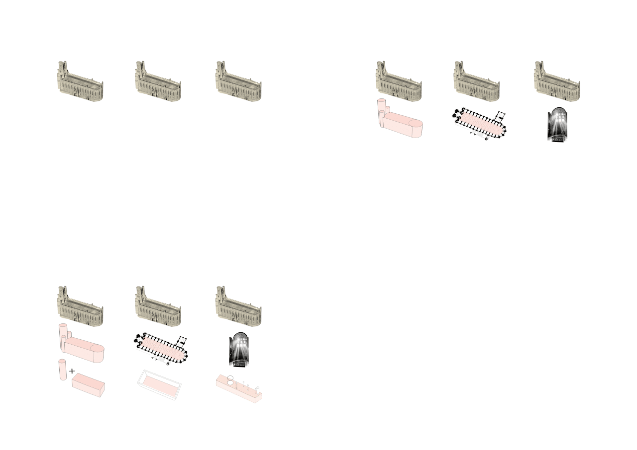
I broke it down into three basic elements - the physical volume, the interior space and the dramatic lighting.
For the volume I firstly needed to simplify the cathedral into very basic geometric shapes. Following the example I decided to limit myself to using only the two basic observed shapes; these being prisms for the horizontal elements and cylindric shapes for the vertical ones.
Moving over to the interior organisation, most of sacral architecture uses emptiness to support its dominant majestic presence. It was clear that I wanted to partially repeat this strategy and recreate the feeling of a big open space that you get looking along a cathedral.
The last characteristic element I chose was light. Every church or cathedral uses window openings as a set of tools to set the tone of the building. Light being a very suggestive component for human beings it easily triggers visitors' feeling and manipulates the overall atmospehere of any space. Being a gothic piece of architecture, St. Cecile's cathedral in Albi with its highly dramatic light effects is a perfect example of this strategy.
Following all of the references and chosen pieces of inspiration listed above I tried to organize the overall design in a corresponding matter, The bulding contains two main levels, both of which are underground and the lower and upper floor are connected into one space through an open gallery.
The roof of the bulding is perforated with skylights, which add to the public space outside and are supposedly a source of the dramatic lighting.
The main entrance is located on the upper underground floor and I wanted to recreate the effect of having some kind of "balcony". This is often seen in churches, where the organ-lofts and side-galleries are elevated above the main space and overlook the entire interior. My intention was to achieve the same sense of offering visitors a view/an observing point from where it would be possible to watch what is happening in the rest of the biulding. Therefore, I left the majority of the floor empty and avoided a horizontal division from the lower floor.
The heart of the building is placed on the lower floor, which provides room for the actual exhibition space - observeble from the floor above. Part of the floor with lower ceiling height - hidden under the upper floor area - includes spaces for the café, the conference room and services.
The placing of the entrance situated on the upper underground floor, consideres sloping of the terrain on the site. From the square it seems to be fully submerged under the ground level; however, the grounds of the Toulouse - Lautrec museum have a lower altitude. I wanted to take advantage of this fact in my design and decided to place the entrance door next to the tourism office. Here there are stairs connecting the height difference between two levels and adjacent to them is a block of terrain tall enough to fit a door.
The ground floor plan shows the volumes of skylights present on the square. Only four of these act as solid forms growing above ground, all of which are designed to have various heights and perimeters, where the very left one is supposed to be the most dominant - accenting the end corner of the building. The remaining two are simple openings in the ground, that grow in the opposite direction creating the illusion of being hanged from the ceiling on the inside. The last and biggest circular shape is another specific type of an opening - this one is supposed to be only a narrow circular gap in the roof.
First on the upper underground floor is the long entrance hallway, which leads to the main open hall. This narrow space without any exterior lighting offers the use the above mentioned light installations that could illusionally shape the interior space.
The hallway opens up into the main space on this floor, where the information desk, bookshop and "viewing" balcony is situated. I wanted to avoid the use of partitions and closed spaces; therefore, only a free standing wall in the middle is used - this is also thought to me semi-transparent in order give visitors a peek of what is behind.
The floor is finished of with an arched floor which is supposed to function as the balcony described earlier. From here the visitor can see the whole galler under, observe the exhibition and other visitors. It is thought to stimulate the feeling of awe as it offers a view of the majestic volume.
Visitors can descend to the gallery through a spiral staircase following the curve of the arched floor or by an elevator - adjacent to which there are additional service rooms - situtated on the opposite side.
The second underground floor holds space for the most important places of the extension.
Starting with the biggest of all, there is the exhibition area. I wanted to avoid using fixed partitions and separated rooms once again, so I used free standing walls in the middle - supporting the elongated character of the volume - and incomplete circular walls; therefore, the visitors are allowed to roam around the exhibition freely.
The exhibition area is closed off by the structure of the staircase and this wraps around another rather important room, which is the conference hall. Circular in shape again it divides the floor into two halves and separates the space without the use of doors.
The remaining space on the floor is meant to be used for the coffee shop. I thought of it as an open area, kind of like a square with free-standing temporary stands. For this reason I organized it into an open space without strictly defined border and the café's area is supposed to freely flow between the incomplete circular walls. Both the stairs and the elevator are pointed in such a direction to force the visitors cross the designed café as well.


Žiadne komentáre:
Zverejnenie komentára